You are using an out of date browser. It may not display this or other websites correctly.
You should upgrade or use an alternative browser.
You should upgrade or use an alternative browser.
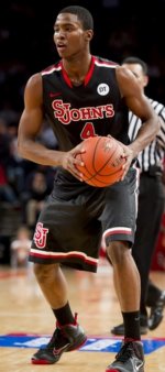
Blackout Uniforms
- Thread starter RedStormNC
- Start date
dk423
Well-known member
They've already changed their name to the Commanders. 0% chance that's happeningIf Washington Football Team goes back to the Redskins we should go back to the Redmen. Just keep Johnny Thunderbird. I use to not be a fan but kids love him and a great stocking stuffer for any child 0-7.
Actually the logo is less St. Louis Cardinals than the logo the baseball team use to use which was the actually St. Louis Cardinals logo with the a “J” substituted for the “L”. I preferred that one better but have grown to like the current one.I never cared for “Red Storm” and I doubt I ever will. It sounds icky to me when fans scream it in unison.
I do like “Johnnies” however. Maybe one day they market that name more. I only buy merchandise with “St. John’s.” Heck, I am only lukewarm on the logo. It is too St. Louis Cardinals for me.
Ah. Whatever. Let’s just win a national championship and scream “we are the champions!”
As for the Jersey, I like the monogram (?) on the back with the skyscrapers and bridges.
One of the few things I like about the Mets is the black Jerseys and caps.Hate the black unis - hate them for the Mets, hate them for the Johnnies...
The same percentage as the Cleveland Guardians reverting back to the Cleveland Indians or the Stanford Cardinal reverting back to the Stanford Indians.They've already changed their name to the Commanders. 0% chance that's happening
Last edited:
RedmanMike
Well-known member
I always like SJU85's posts, but... noooo!!! Traditional pinstripes or the Brooklyn Dodgers homage (all-white) jerseys only.One of the few things I like about the Mets is the black Jerseys and caps.
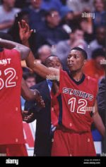
Jordan Era... loved theseNot often we could say the school did something absolutely correct, but these were sleek. I would love to see them again.
View attachment 3596View attachment 3597
Moose
Well-known member
Thats why they are alternate uniforms. You don't do the same that you do on the others.I don't hate Red Storm like many, but the uniforms should always say St. John's. There is just something powerful about that name in college basketball.
If no legal issue, I'd love "Johnnies" in that script as an alternate. Similar to Seton Hall.Actually the logo is less St. Louis Cardinals than the logo the baseball team use to use which was the actually St. Louis Cardinals logo with the a “J” substituted for the “L”. I preferred that one better but have grown to like the current one.
As for the Jersey, I like the monogram (?) on the back with the skyscrapers and bridges.
fan since 65
Well-known member
Beauty is in the eye of the beholder. I despise that script on Seton Hall's uniforms. Sort of looks like CYO-level to me. It's like they use the same uniforms every year with minor tweaks since forever.If no legal issue, I'd love "Johnnies" in that script as an alternate. Similar to Seton Hall.
carmineabbatiello
Well-known member
I don't care what we wear. I only care about the final score.
Definitely! I really like these but if we lose to DePaul to open Big East play then I will hate them.I don't care what we wear. I only care about the final score.
Surely winning matters exponentially more than anything else.
Brand identity does matter. We are not the Yankees that basically can have one uni look for a century. ...No one else can.
Top teams have alternate jerseys and can vary them. Here's just one example with Kansas last year. Many stories and top programs do it. Sure, it can generate revenue but it also creates attention and can get players excited. No different than when UNC or a few others get the latest Jordan brand inspired colors. Or when Nike school Oregon came out with those fluorescent green uni's.
Not sure whats preventing us from bringing bsck our Jordan era logo or a tweak on it but thats the kind of stuff we need to do. .we did it too w/ the Felipe look but need to do more of it. The Jordan uni's would get a lot of attention.

 www.si.com
Brand identity does matter. We are not the Yankees that basically can have one uni look for a century. ...No one else can.
Top teams have alternate jerseys and can vary them. Here's just one example with Kansas last year. Many stories and top programs do it. Sure, it can generate revenue but it also creates attention and can get players excited. No different than when UNC or a few others get the latest Jordan brand inspired colors. Or when Nike school Oregon came out with those fluorescent green uni's.
Not sure whats preventing us from bringing bsck our Jordan era logo or a tweak on it but thats the kind of stuff we need to do. .we did it too w/ the Felipe look but need to do more of it. The Jordan uni's would get a lot of attention.

K-Uniform Report: The New Home Alternates for the Kansas Jayhawks
Kansas recently debuted two new uniforms. Let's critique the new looks.
Last edited:
Damnit. I left my black sju shirt in Fla.
I prefer our dark blue uniforms to black.
Not a big fan of these whiteout or blackout games. Seems silly to me.
Black is slimming though.
I prefer our dark blue uniforms to black.
Not a big fan of these whiteout or blackout games. Seems silly to me.
Black is slimming though.
Let's play shirts vs. skins, like we did in intramurals. Costs are zippo.


