St. John's / Home Field


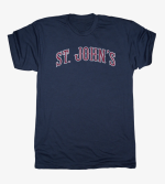
Someone posted a preview photo. Assume they'll have more designs, but these are legit some of the ugliest shirts I've ever seen. Looks like an upstart 90s heavy metal band. Also not a fan of bringing the horse back. St. John's branding is bad enough going from a Native American to a horse to a bird. I may have bought if they went with the storm cloud / lightning bolt since that's far more recognizable and relevant. Hoping there's something better in the full drop.
 
middle one not bad the one on the right " Horse meets Shazam " awful

Kranmars early renditions of " Section 114 " apparel light hears ahead of this stuff
 
I don’t hate the middle one at all

I don't hate it as much as the other two but I still hate it and think it's not as nice as the standard SJU shirts you'll see in the book store.

What I'd love to see is that practice jersey the team wore during the Lavin era. Can't find a pic but it had the Manhattan skyline in the text. Nicer than anything the school has released in a long time.
 
I know I’m old but I don’t believe even the kids will like these designs.

Of course, I‘m not hard to please. A simple Red sweatshirt that says “St. John’s“ really shouldn’t be that hard. Yet, somehow, we can’t master the simple design.

Hey, the bookstore has this.
 
I guarantee whoever made these knows nothing about the school, did a quick Google image search for "retro St. John's logos", saw the Redman and knew they couldn't use that, then saw the horse and thought "oh cool, horses are nice". Anyone who follows the school either A. doesn't even know the two horse(s) were at one point mascots (quick- does anyone remember their names?) or B. knows they were only the mascot/logo for a few years before being dropped. I'm not saying there aren't any fans who still like the horses, I'm sure a few do, but even on this site and Twitter the logo is rarely used as an avatar. Home Field deserves the low sales they'll get.
 
There’s plenty of other schools that Homefield has done apparel for so if you want an idea of what the stuff will look like just check them out. Most of their stuff has a “retro” vibe to it so don’t expect plain shirts that just say St. John’s or an SJU logo. And while some here may not like that style, it is much better received by the current college population.
 
All I see is the creepy doll over the shoulder. 😯 I can’t unsee it.
Ha! I took the picture from my 14 year old daughter’s room, and she still has a small section that has a few of her American Girl dolls on display (not all, because there was a time when her room was basically the AG store). Not sure with one is that.
 
Ha! I took the picture from my 14 year old daughter’s room, and she still has a small section that has a few of her American Girl dolls on display (not all, because there was a time when her room was basically the AG store). Not sure with one is that.
Didn't notice the doll until she was mentioned. Now I'm going to be having nightmares and waiting to see Kranmars on the front page of the New York Post...
 
Back
Top